Tom Clohosy Cole
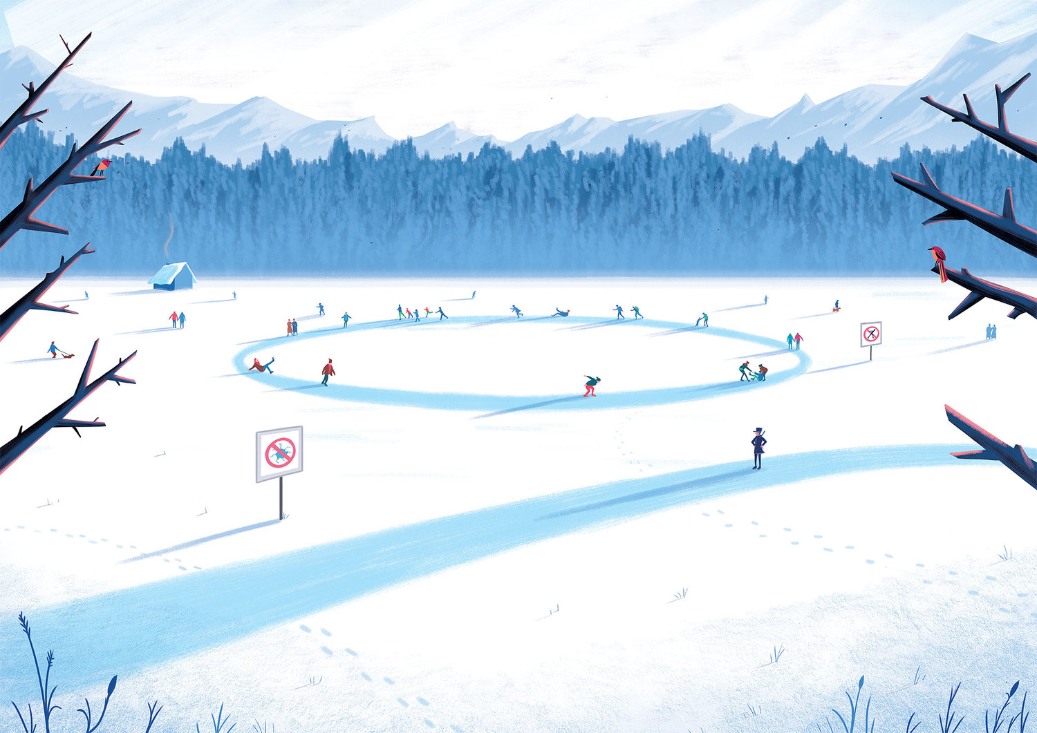
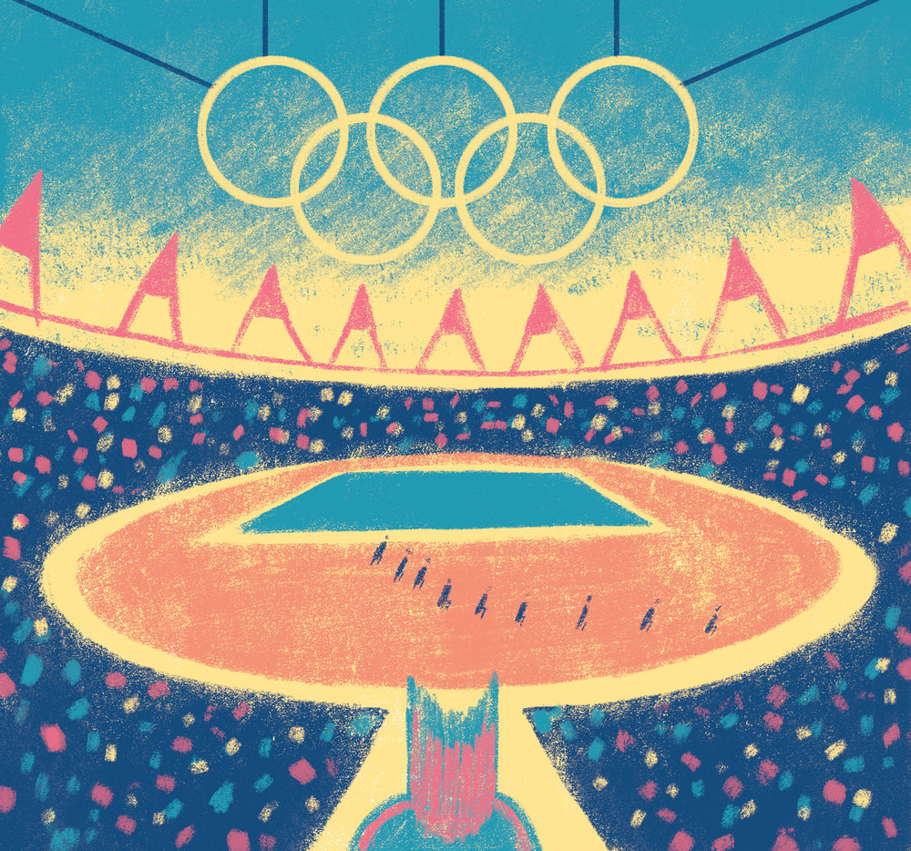
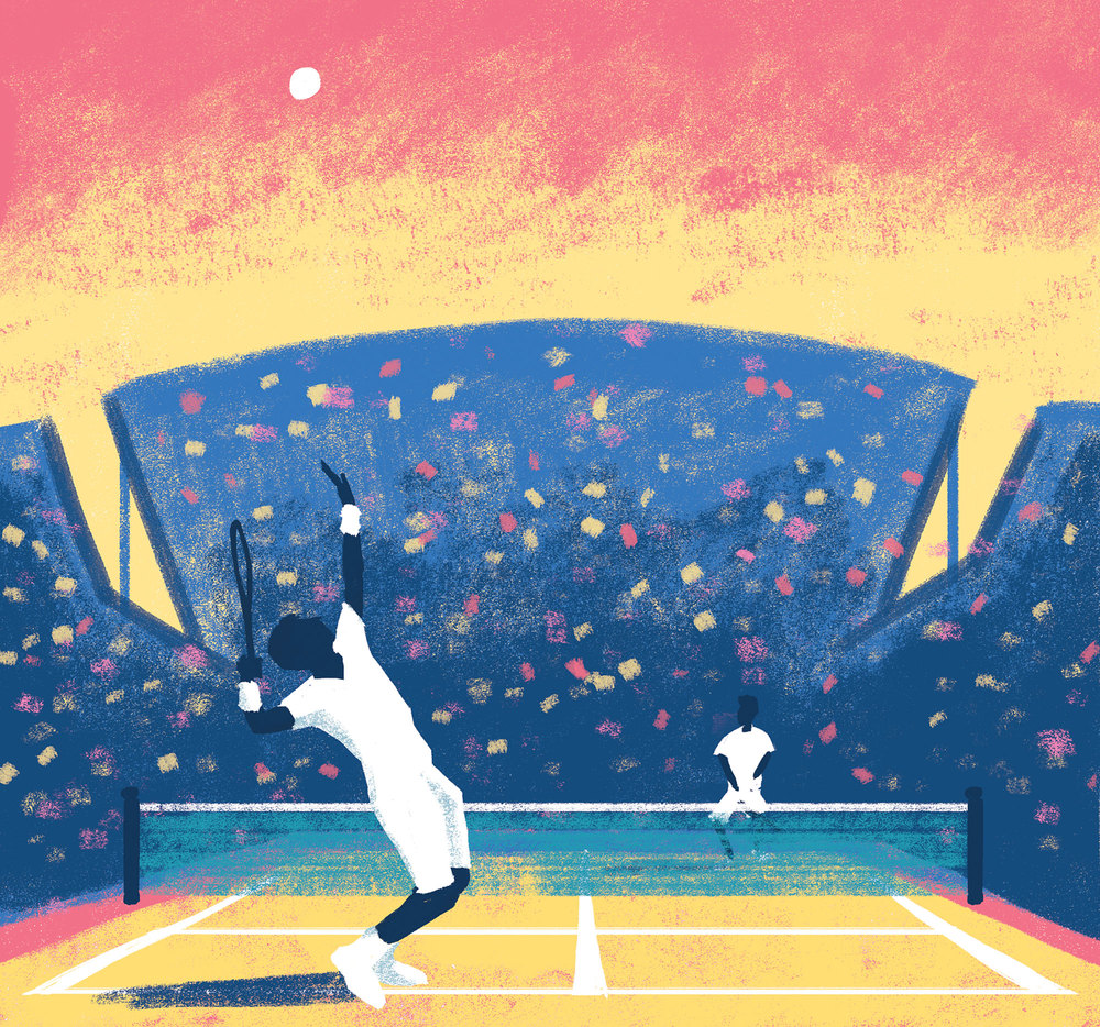
Tom is a freelance illustrator and designer based in London. We were lucky enough to work together on a project for Google that added to his ever-growing client list that includes The New York Times, The Guardian, Fullers Beer, Sony and British Airways. Tom is a great lad to work with and is fast establishing himself as a creative force to reckon with in the industry. His work brings beautifully crafted and imaginative scenes to life with iconic compositions, cleverly treading the line between digital and traditional painted styles. We recently caught up over a beer to see what the Brighton-born lad has been up to.
Take it away TCC:
---
How did it all start for you?
When I was 17 and studying AS level Art, David Hughes (An Illustrator) came in to my college and gave a talk about illustration. I had never really thought about it as a career until that point, but I loved Art at college and knew I wanted to continue drawing. From there I applied to Kingston University and after a fun 3 years of studying I thankfully managed to find work as a freelance illustrator.
How would you describe your style?
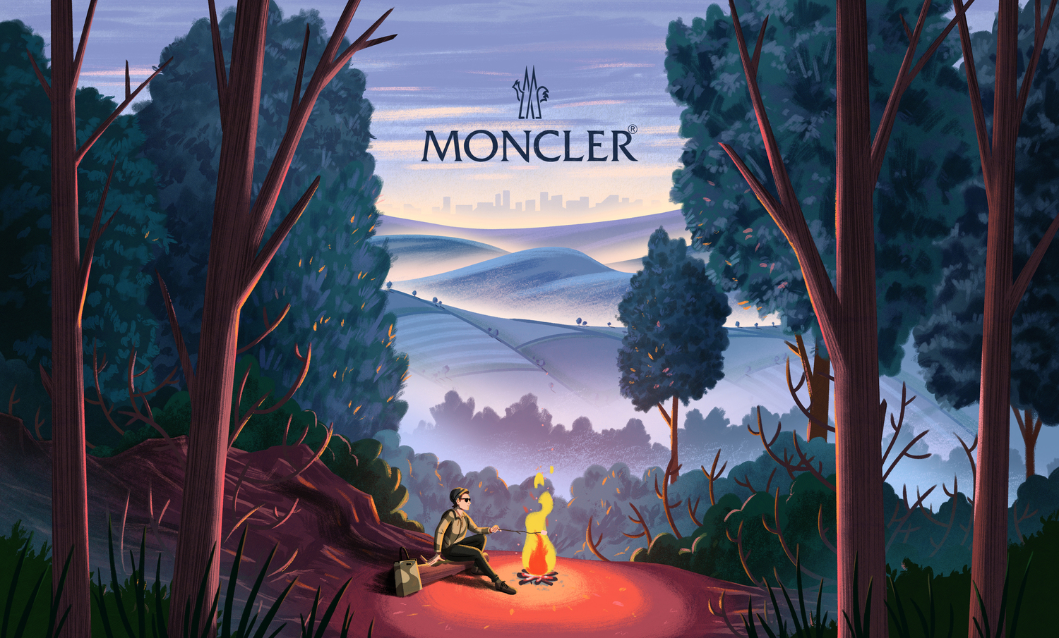
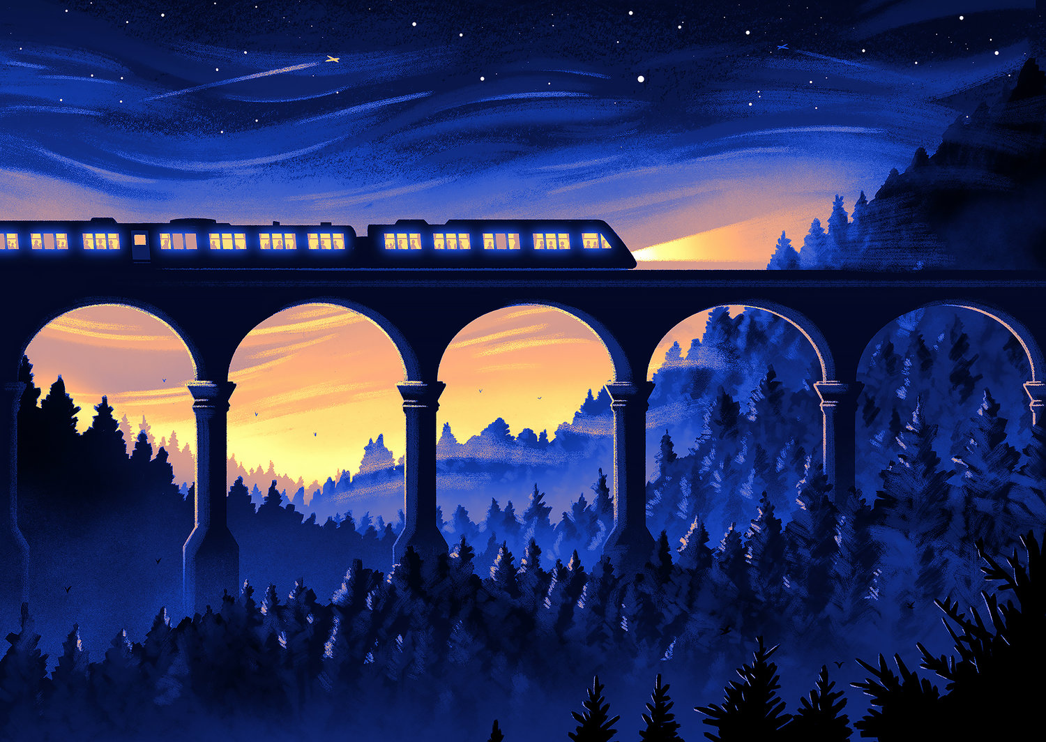
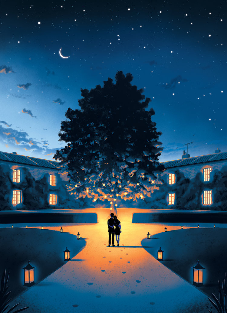
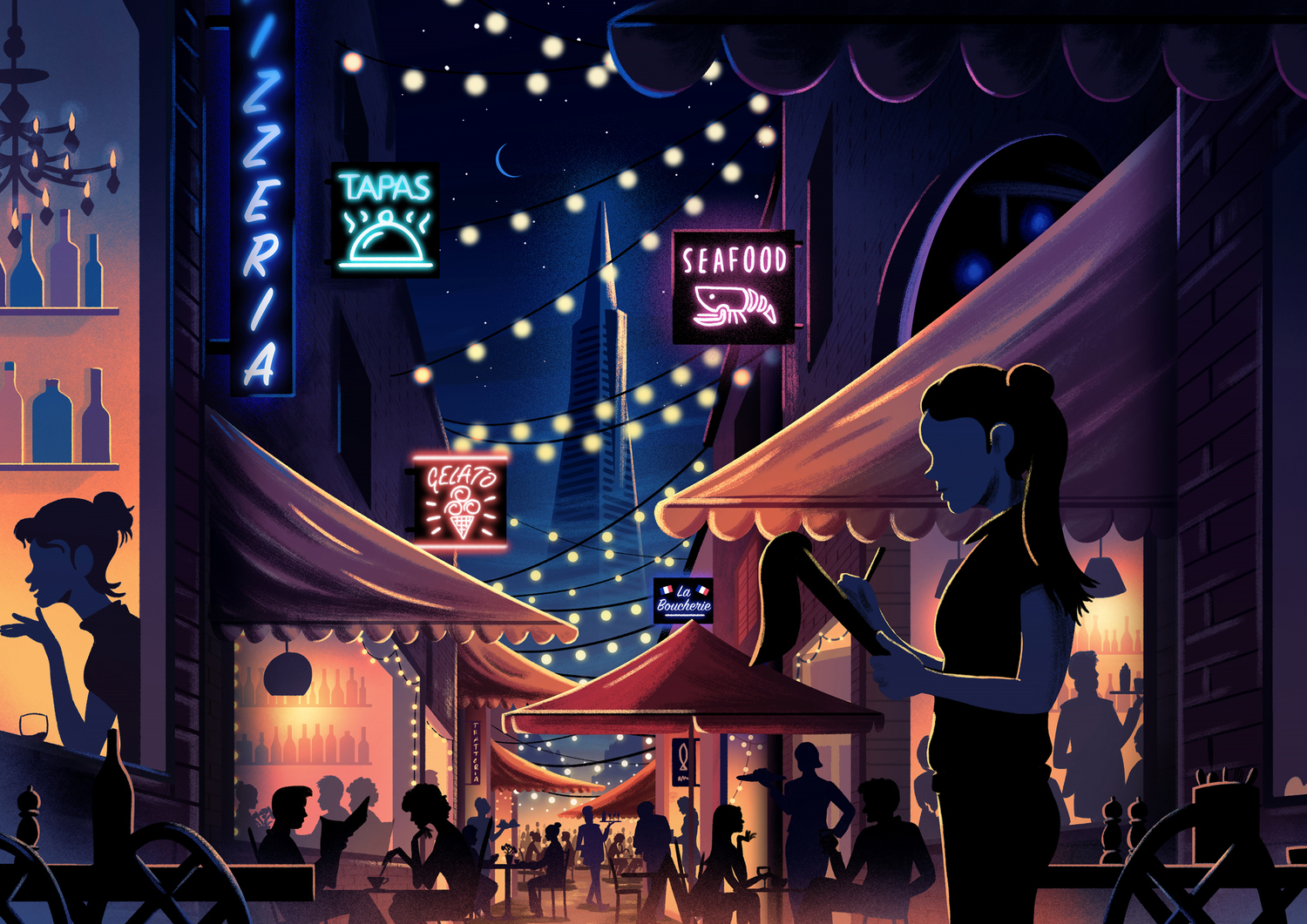
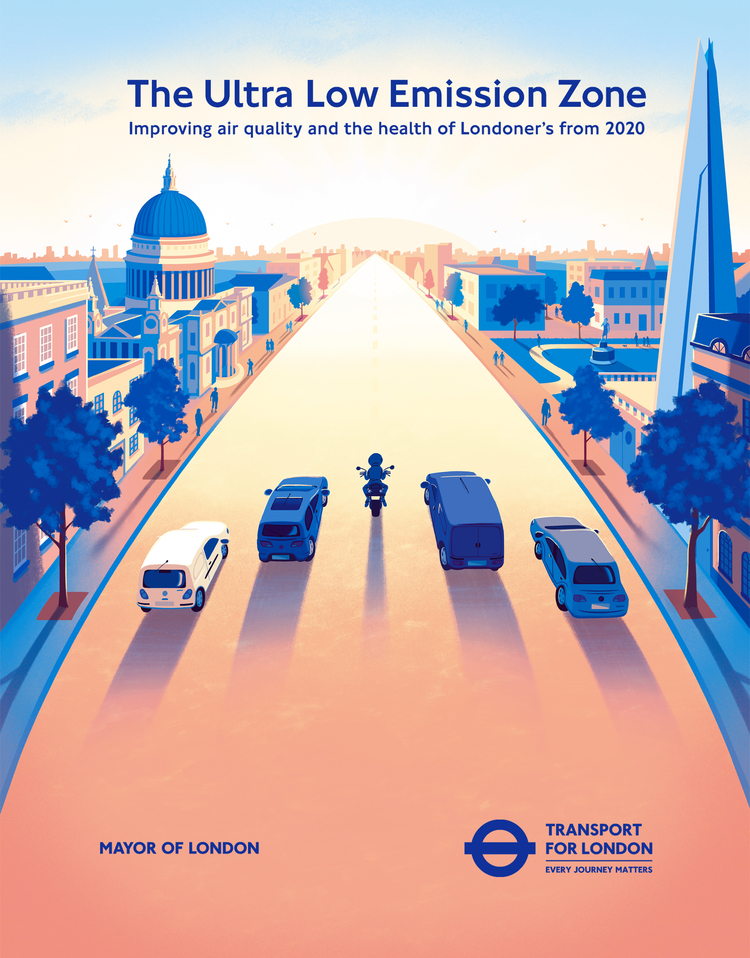
Haha, I’ve always struggled answering this question. I would probably mention that I work digitally, my work tends to be quite colourful and I love drawing landscapes and skies.
What project are you most proud of?
I’ve made some books that I really enjoyed working on. Doing the Guardian’s preview of Harper Lee’s ‘Go Set A Watchman’ release was a really good job for me and for exposure.
Books are great time capsules, and its nice to look back at the different projects and see how the way I work has changed.

What are you working on now?
I’m just starting a new Book, which is the follow up to Destination: Space. I can’t say much more than that, but i’ll be drawing some Volcanos.
Your style always has a dramatic edge, from iconic natural scenery to unreal fantasy space scenes. Where do you find your inspiration for these subjects?
I really love old landscape painters and people who use light well like Albert Bierstadt or John Martin. I also look at a lot of Photography and Film for inspiration. It’s quite nice to escape into these images and worlds when your stuck in a studio in the city.
What are you currently fascinated by and how is it feeding into your work?
I loved the Art Direction in the new Ghibli film ‘The Red Turtle’ by Michael Dudok De Wit, some really beautiful design in there!
How would you say your style has developed over the years?
I think ‘time’ has had the biggest effect on my work. I need to make work much more quickly as I have more on my schedule than I did when I first started out. I used to use a lightbox for everything and scan all my work in. Now I have cut away all the processes which were taking too long. My work is all digital these days and I use brushes and actions to speed things up.
What's been the most notable experience as a result of your work?
Doing workshops at primary level is a really rewarding experience. Primary classes are full of energy and excitement so its a really elevating spending time with kids.
What’s your personal motto?
The wind doesn’t break a bendy tree.
3 top tips for any up-and-coming illustrator?
1 - Be willing to try everything and anything.
2 - Work the same hours as everyone else, even if you don't have work on.
3 - Get the work you want to get by doing lots of mock projects with that guise.
What equipment and techniques do you like to use?
Right now I use a Wacom to draw on Photoshop and InDesign. I’m a big fan of Photoshop, there’s always more to learn! I’ll jump on to the cintinq in a year or so when the screens are a bit sharper.

