'Bouffes Du Nord Theatre'
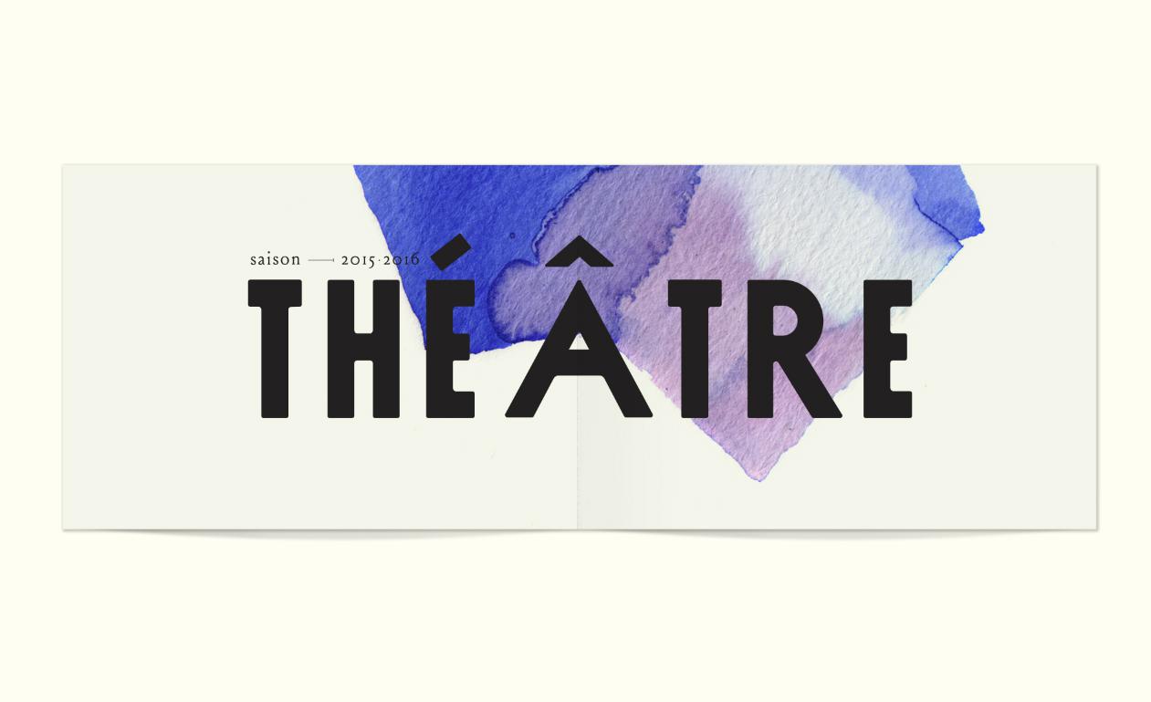
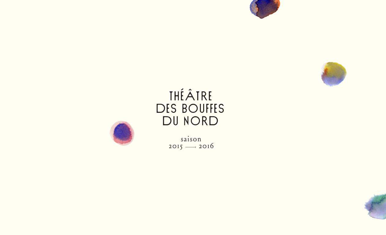
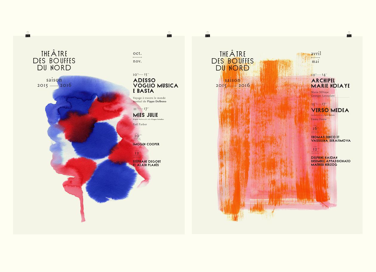
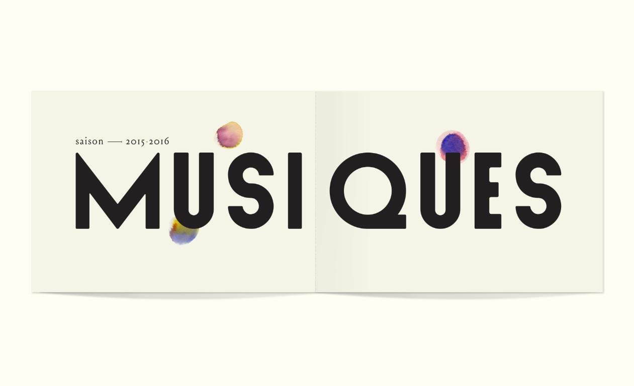
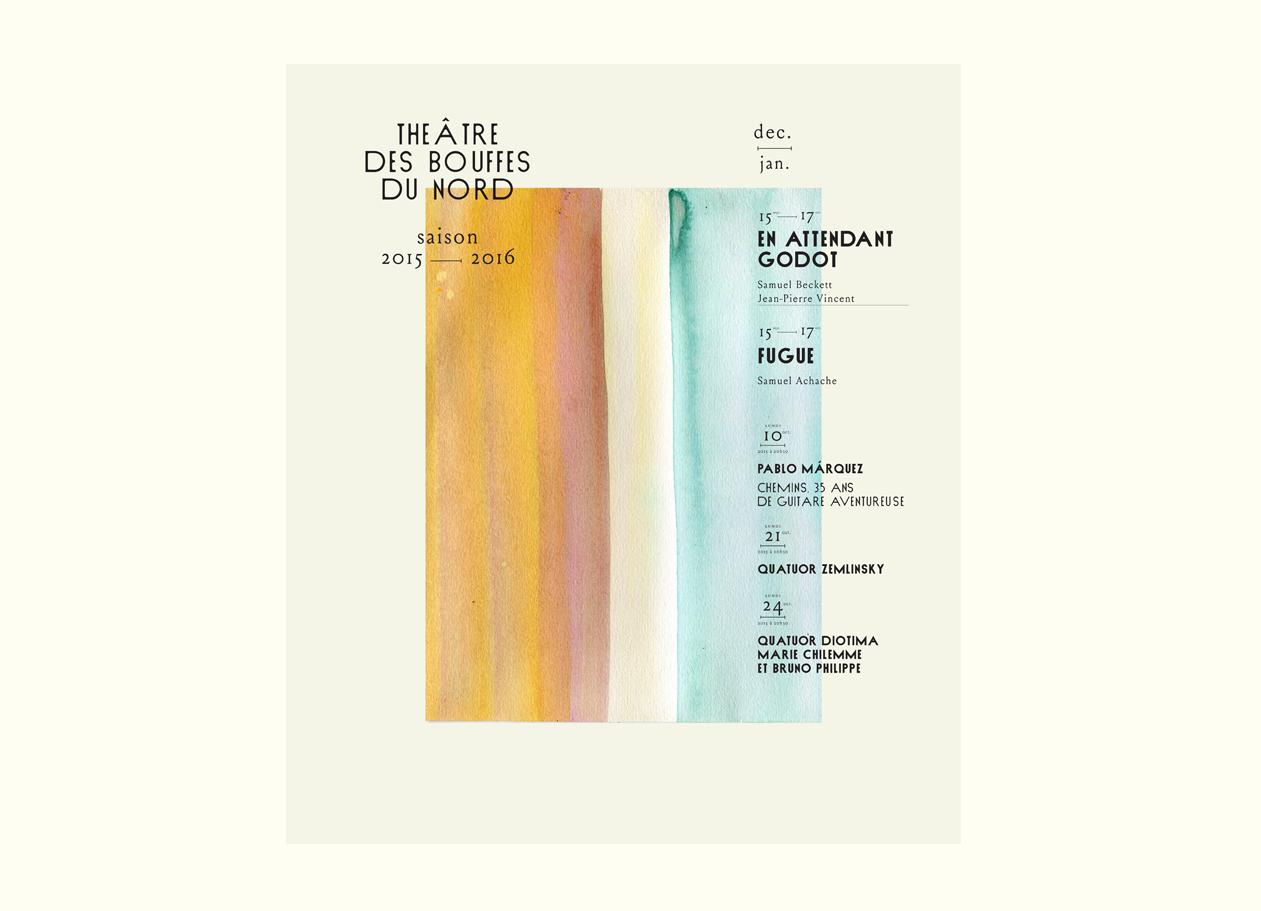
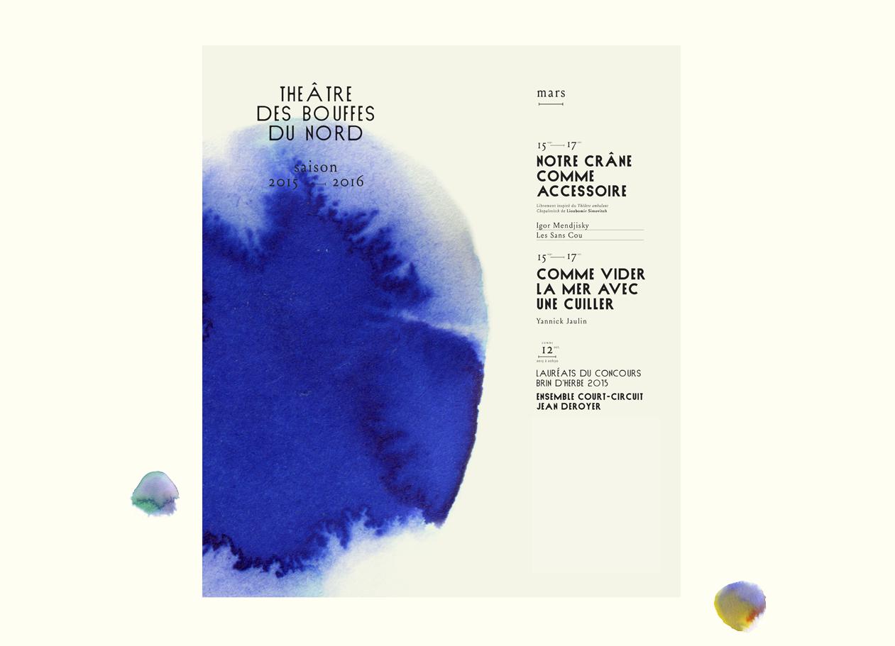
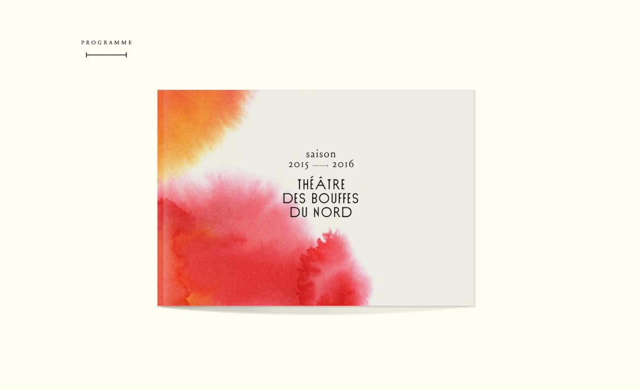
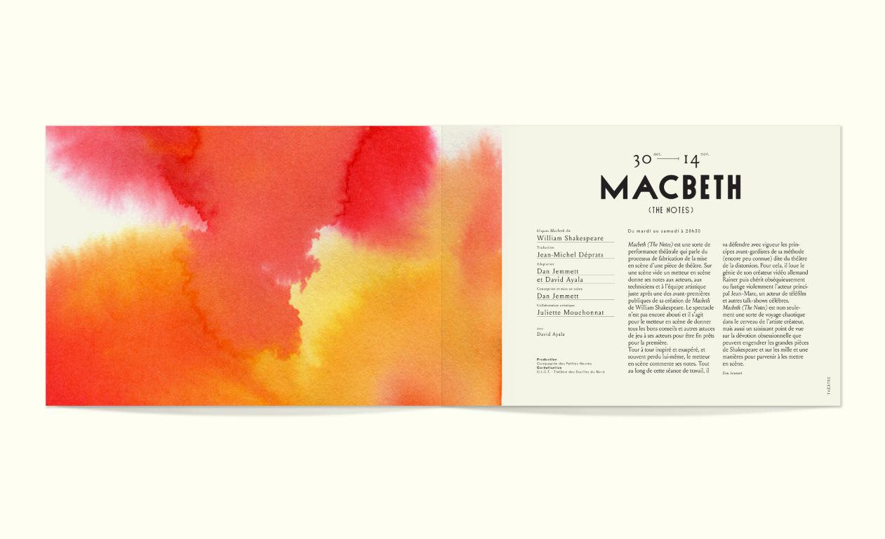
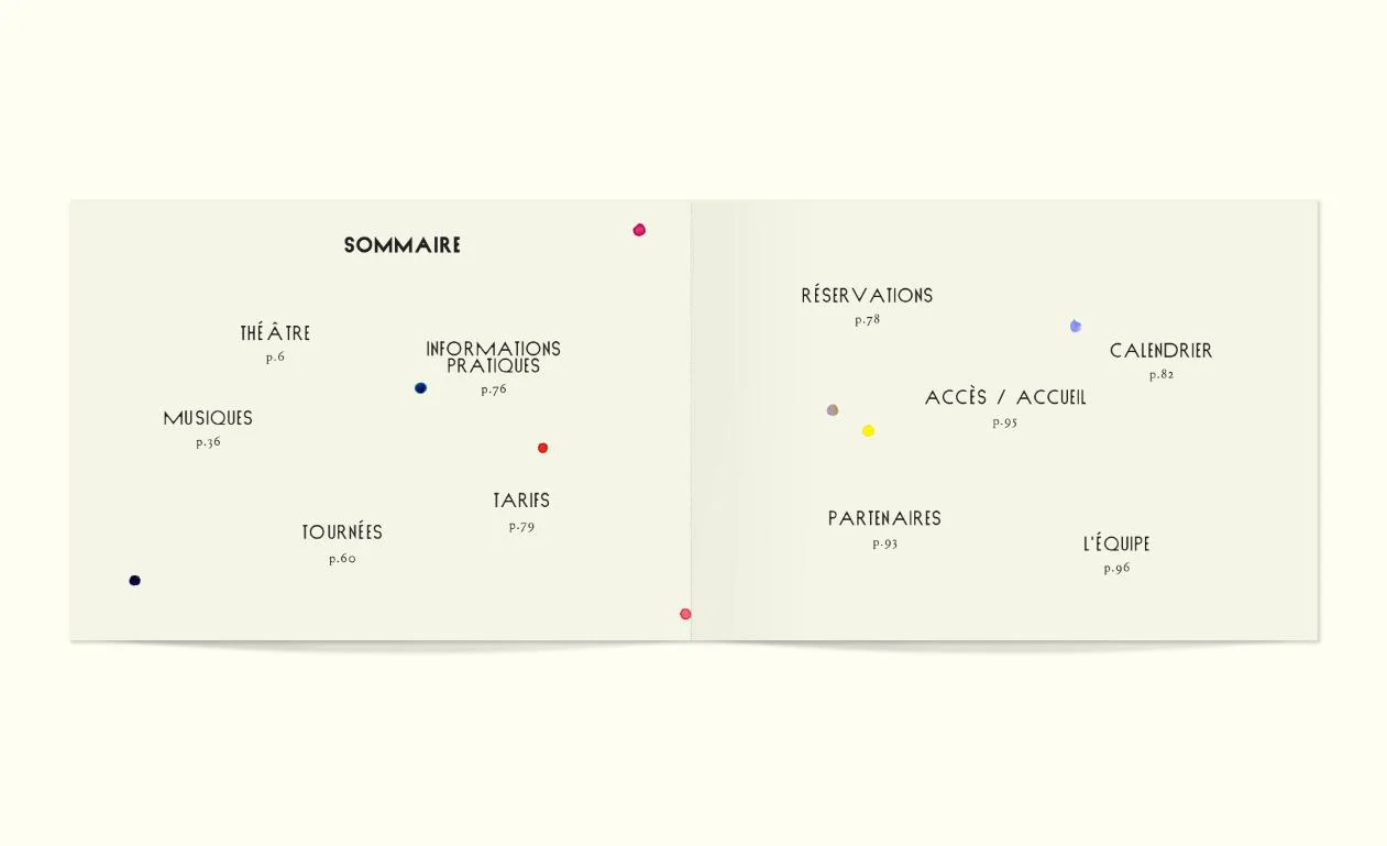
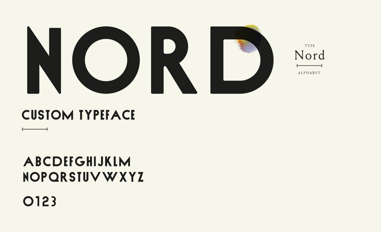
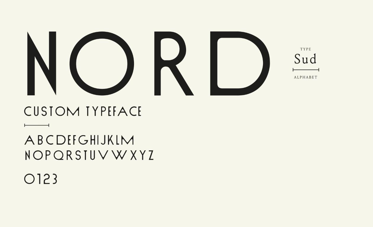
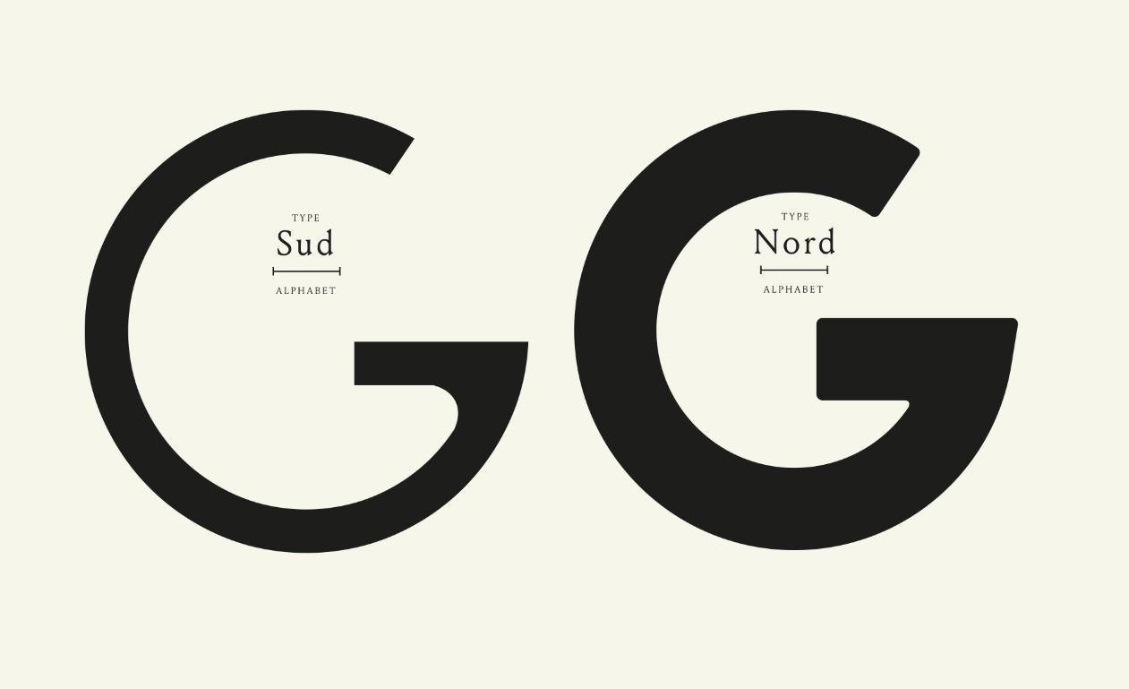
The stunning work of french design and illustration studio, Violaine & Jeremy came to our attention this week with the launch of their work for Bouffes Du Norde and the 15-16 Season. Creating the identity, posters and programmes, the concept of colour to trigger emotions plays a wonderfully simple and intriguing part in portraying each play and work to it's deserving audience. The project explored chromatic scales, pigments and inks, as well as a custom typeface that cleverly plays on a North - South naming in relation to a Bold - Regular weight. The incredible attention to detail and layouts that really appreciate the use of white space and composition are a refreshing masterclass in layout design. See more lovely work from them here.
GoodFromYou Violaine & Jeremy


